Creating Curly Brackets with SCSS
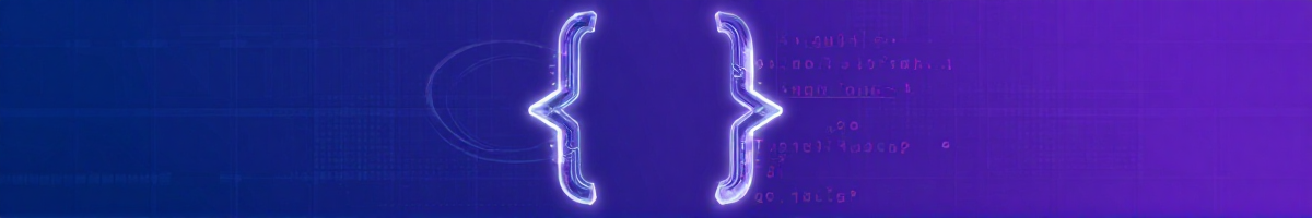
Back when I was assembling the first version of this website, on a whim, I decided that I wanted to frame the introductory home text in curly brackets: { and }. At the time of this wondrous idea, I also happened to be interested in creating various geometric shapes with pure CSS/SCSS and admittedly I didn’t want to mess around with positioning characters from some arbitrary font – I don’t think that would be a particularly nice solution. One thing led to another and hey presto, I had created something akin to curly brackets using only border effects and the ::before & ::after pseudo-elements. Why you may ask? I guess that it is because they have become synonymous with computer code and it somewhat fits the theme I was going for. Read on if you are interested in how I made them; or if you just want to use the code, a working example on CodePen is available at the bottom of this article.
SCSS Triangles
First things first, if you do not already know, it is quite possible to create triangles using only CSS – no images – by taking advantage of a subtlety of borders around a DOM element. I’ve used them in replicating the sticky-outy bit in the middle of the bracket – apologies for the less than technical term; however, as triangles are a very well documented CSS technique on Google, I will not be delving into their quirks or construction. For the sake of example though, below is SCSS mixin implementation of a triangle from my source code of this site – feel free to adapt or use your own version.
/* An element in the shape of a triangle * $base Width of the border at the base of the triangle (i.e. border opposite direction) * $left Width of the border to the left of the base * $right Width of the border to the right of the base * $dir Direction of the primary apex of the triangle [top|right|bottom|left] * $colour Colour of the shape */@mixin triangle($base: 1, $left: 1, $right: 1, $colour: black, $dir: top) {  // Possible triangle orientations  $dirs: (    top: (bottom, left, right),    right: (left, top, bottom),    bottom: (top, right, left),    left: (right, bottom, top)  );
  // Check if a correct orientation has been passed  @if map-has-key($dirs, $dir) {} @else {    @error "@mixin triangle requires a valid direction. E.g. top, right, bottom, left";  }
  width: 0;  height: 0;  border-#{nth(map-get($dirs, $dir), 1)}: $base solid $colour;  border-#{nth(map-get($dirs, $dir), 2)}: $left solid transparent;  border-#{nth(map-get($dirs, $dir), 3)}: $right solid transparent;}
For those who are unfamiliar with sassy mixins, simply include the mixin under a relevant
selector by using a statement such as @include triangle(24px, 24px, 24px, black, top) and
compile the stylesheet to CSS as usual.
SCSS Curly Brackets
Much like the triangle mixin above, I implemented the brackets in a similar way to include on an element. Now that we can produce triangles, my method for creating the sticky-outy bit of the bracket is by absolutely positioning two triangles in the ::before & ::after pseudo-elements; one coloured as the bracket, and another overlaid on-top with the colour of the background. For example, if we are producing a bracket on the left or right of the element, we’ll denote this direction with the variable $dir, we can use something like the following.
&::before { content: ""; margin: auto; position: absolute; @if $dir == right or $dir == left { top: 0; bottom: 0; } #{$dir}: -$h - $w / 2; @include triangle($h, $h, $h, $colour, $dir);}As the overlaid triangles occupy the ::before & ::after pseudo-elements, the main element is free to use its own border effects. This allows a solid border to be set on the relevant side of DOM element; creating the main body of the bracket.
border-#{$dir}: $w solid $colourNext, the top and bottom end or curly part of the bracket. We are only using a single border on the main element, and so a simple border-radius will successfully emulate the curly ends of the bracket. As a CSS3 feature, this can be implemented in a cross-vendor and compliant way using the following mixin.
/* Cross-vendor border radius */@mixin border-radius($val: 0) { -webkit-border-radius: $val; -moz-border-radius: $val; -o-border-radius: $val; border-radius: $val;}This can be set on the bracket with @include border-radius($radius) and it roughly
concludes the main styling considerations for the brackets. Taking the above into account, a
mixin for producing a bracket can be made; which could result in one like mine below.
/* For making a curly bracket around a dom element - only one mind * $radius Radius of the bend at the curly parts of the bracket * $w Width of the bracket path * $h Height of the middle outward segment * $colour Colour of the bracket * $bg Background colour of the parent element(s) * $dir Which side of the element to add bracket [top|bottom] * @note Target element must be careful with the ::before/::after pseudo elements. */@mixin curly-brackets($radius, $w, $h, $colour, $bg, $dir) {  // Check if a correct orientation has been passed  @if $dir == top or $dir == right or $dir == bottom or $dir == left {} @else {    @error "@mixin curly-brackets requires a valid direction. E.g. top, right, bottom, left";  }
  width: 100%;  height: 3 * $radius / 2;  border-#{$dir}: $w solid $colour;  @include border-radius($radius);  position: relative;
  &::before, &::after {    content: "";    margin: auto;    position: absolute;    @if $dir == top or $dir == bottom { left: 0; right: 0; }    @if $dir == right or $dir == left { top: 0; bottom: 0; }  }
  &::before {    #{$dir}: -$h - $w / 2;    @include triangle($h, $h, $h, $colour, $dir);  }
  &::after {    #{$dir}: -$h + $w;    @include triangle($h, $h, $h, $bg, $dir);  }}
For skimming readers, notice the use of the @include border-radius(...) and
@include triangle(...) mixins. These need to either be provided – for example with
my earlier snippets – or replaced with equivalent styles.
L’exemple on CodePen
If for some reason the original example is not on the site anymore, here you go.
See the Pen Creating Curly Brackets with SCSS by Taylor Siviter (@siviter-t) on CodePen.